
Brand Guidelines
This guide defines the visual language, design style, and principles that shape a clear and consistent brand experience, no matter the team or area of expertise.
At its core, Redo is about precision and clarity—just like our mission to correct financial errors and optimize balance sheets. This guide lays out the essential design standards that bring our brand to life, from our color system and typography to accessibility benchmarks and documentation.
Whether you're designing for digital platforms or printed materials, these guidelines ensure every touchpoint reflects the trust and efficiency at the heart of Redo.
Contents
01 Brand Strategy
02 Personality
03 Logo
04 Color
05 Typography
06 Art Direction
01 Brand Strategy
In the world of finance, mistakes happen—miscalculations, overlooked expenses, inefficiencies that silently erode profitability. Businesses lose money not because they aren’t earning, but because errors go unchecked.
Redo restores confidence in financial numbers.

Born from the need for financial clarity, Redo was founded on a simple yet powerful mission: to correct financial errors and optimize balance sheets. We believe that precision is the key to profitability, and that businesses shouldn’t be held back by avoidable losses. With advanced technology and expert analysis, we uncover discrepancies, eliminate inefficiencies, and restore confidence in the numbers that drive success.
At Redo, we don’t just fix mistakes—we empower businesses to move forward with accuracy and efficiency. Because when the numbers are right, the future looks even brighter.
02 Personality
Redo’s voice brings our brand to life through the words we write and speak. The way we communicate with customers has the power to transform their financial well-being. Through clear and intentional language, we make financial corrections simple, accessible, and stress-free. Our direct, approachable, and transparent voice ensures that fixing mistakes feels effortless—so our customers can move forward with confidence.

Tone & Voice
Our Vision: why we exist
To create a future where every business maximizes their potential.
Our Mission: what we do
Correct financial errors and optimize balance sheets
Our Promise: how we help
Empower businesses to move forward with accuracy and efficiency
Sample Copy
See an Error? We’ll Make It Right.
Not sure what that unexpected charge is? Worried about an incorrect withdrawal? Instead of worrying or assuming the worst, let us investigate and resolve the issue for you.
Mistakes Don’t Have to Cost You—We’ve Got Your Back
An overlooked charge or a simple accounting mistake shouldn’t throw off your financial plans. We step in to identify and correct these issues before they become bigger problems.
We Handle the Fix, You Focus on What Matters
Your time is valuable, and dealing with financial errors shouldn’t take up more of it than necessary. Whether it’s an unexpected overdraft fee or a billing mistake, we take care of the correction process for you.
Your Finances, Fixed the Right Way
Precision matters when it comes to financial corrections. A small error can have a big impact on your savings, credit score, or future financial goals.
03 Logo
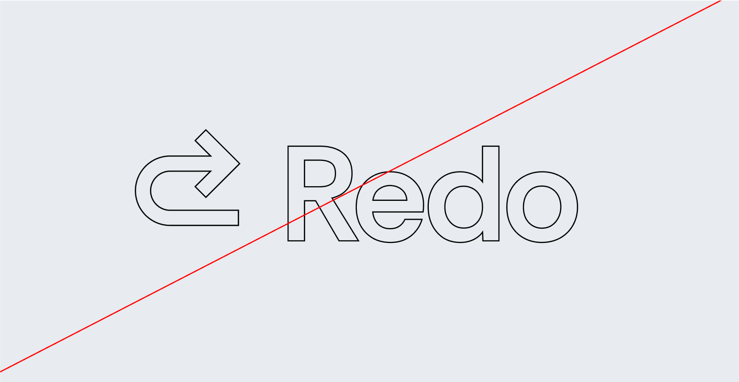
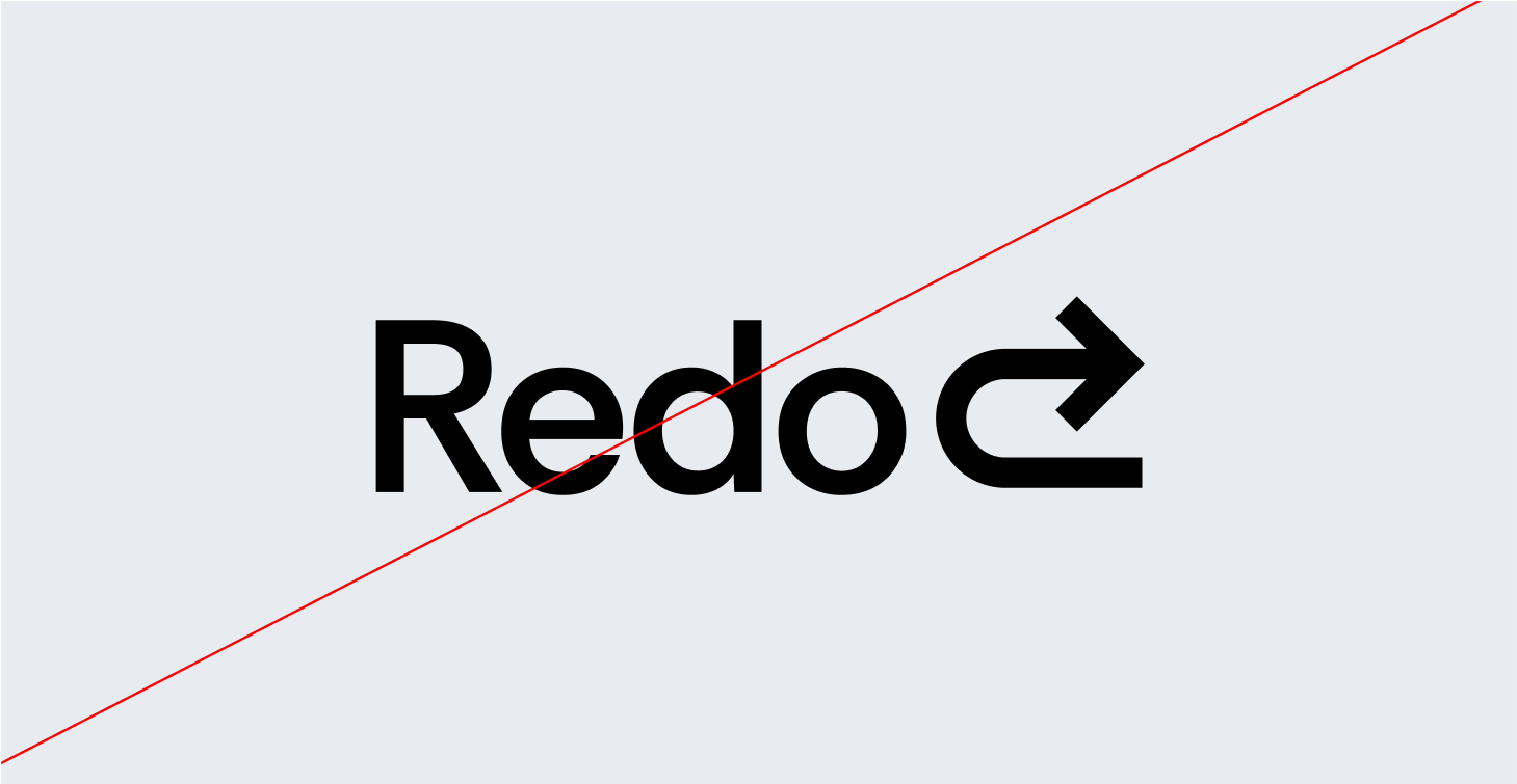
The Redo logo is a sleek, modern arrow that curves backward, symbolizing the power to rewind, correct, and optimize financial decisions. The reversed motion represents our core mission—helping businesses go back, fix errors, and recover lost value.
Designed with clean, sharp lines, the arrow conveys precision and efficiency, while its fluid motion suggests agility and adaptability in financial correction. The color palette reinforces trust and clarity—deep blues or greens for stability, complemented by bold accents to signify action and resolution.
More than just a symbol, the Redo logo embodies our commitment to turning financial missteps into opportunities for growth—because tin business, every mistake deserves a second chance.
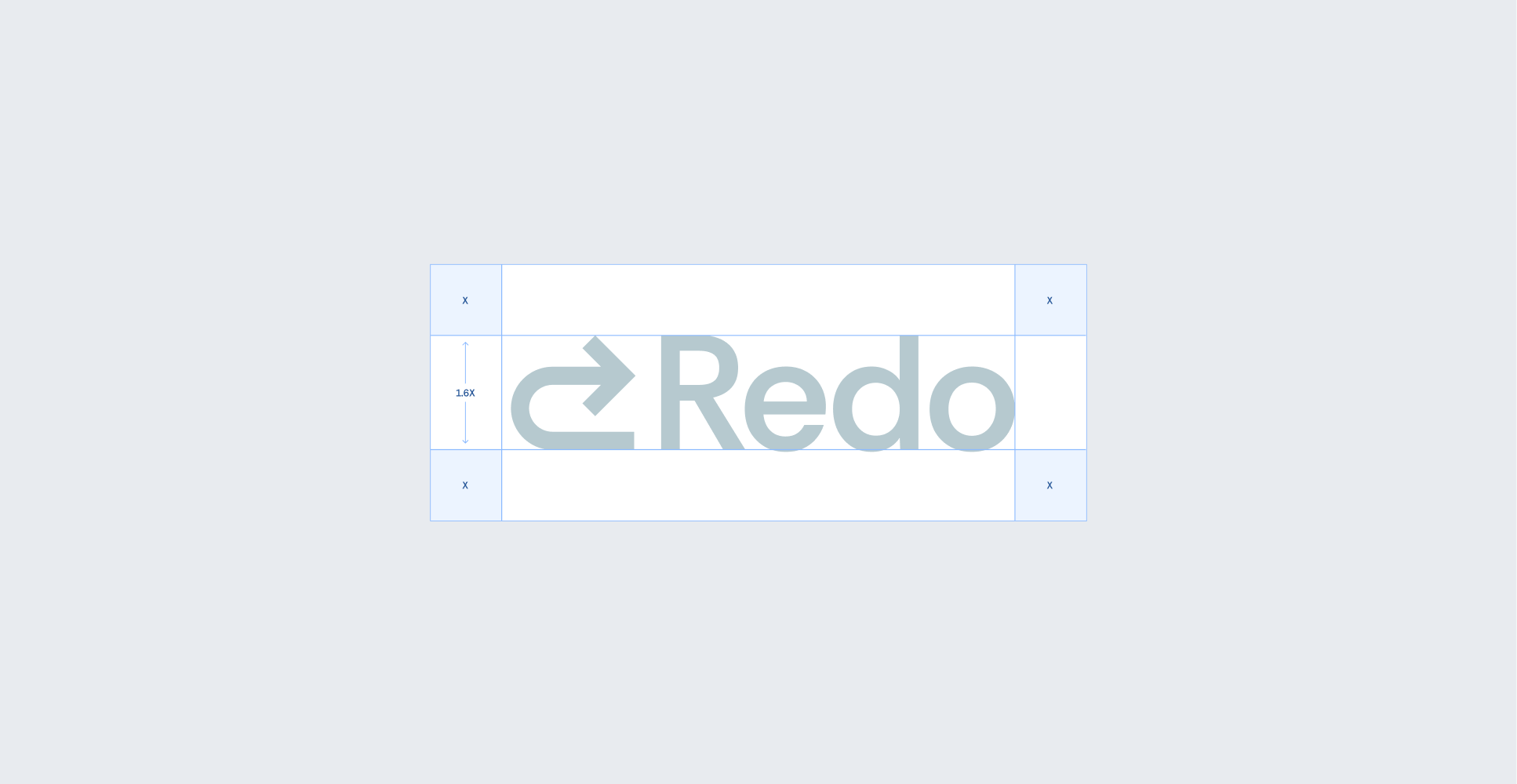
Primary Lockup

Clearspace
Secondary Lockups

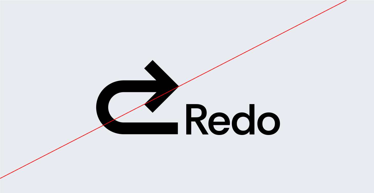
Incorrect Usage

Do not resize the mark
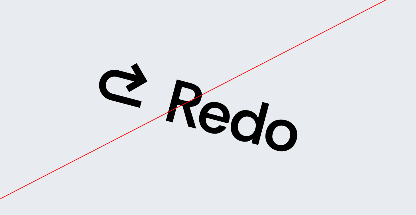
Do not rotate the logo
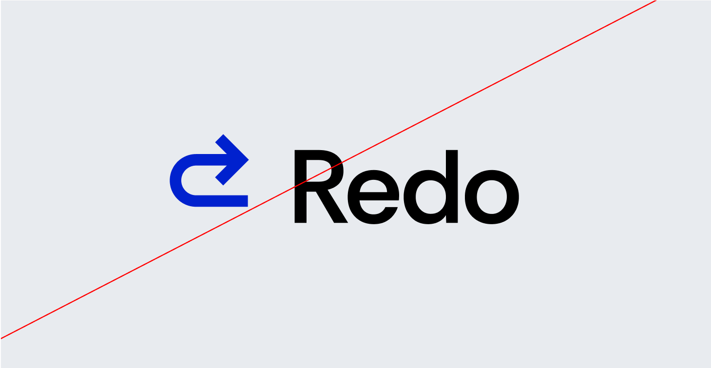
Do not change the color of the mark alone
Do not outline the logo
Do not reverse the lockup
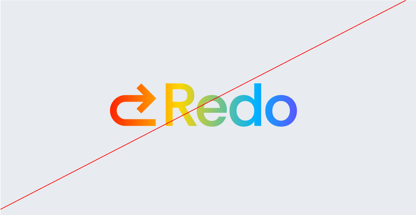
Do not add gradients the logo
Partnerships
04 Color
Redo’s color palette is designed to evoke trust, reliability, and financial clarity, ensuring that every touchpoint reflects our commitment to accuracy and efficiency.
Together, these colors create a strong, dependable, and forward-thinking brand identity, ensuring that Redo is instantly recognized as the go-to solution for financial corrections and optimization.
Primary Palette
Orange
Hex: #FA9819
Blue Tint
Hex: #B6C9CF
White
Hex: #000000
Baby Blue
Hex: #C6EBF7
Secondary Palette
Navy
Hex: #1E3D59
Caption
Hex: #48749E
Sky Blue
Hex: #DEEEFE
Off-blue
Hex: #E8EBEF
Deep Orange
Hex: #CD4900
Black
Hex: #000000
Dark Grey
Hex: #A3A3A3
Grey
Hex: #E5E5E5
Gradient Palette

Gradient 1

Gradient 2

Gradient 3

Gradient 4
05 Typography
Redo’s typography balances clarity and professionalism with a modern yet timeless type pairing, reinforcing our commitment to accuracy, efficiency, and financial stability.
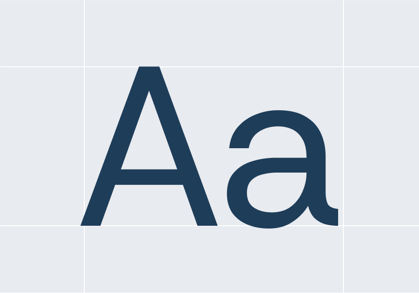
Primary Sans-Serif (Rethink Sans Reg) is a clean, modern sans-serif typeface that ensures legibility and precision across all digital and print materials. Its geometric structure reflects clarity, efficiency, and trust, making it the ideal choice for data-heavy content, dashboards, and user interfaces.
Secondary Serif (Hedvig Letters Serif) is a refined, authoritative serif font that adds a touch of tradition and credibility. Used for emphasis in headlines, reports, and financial documents, it reinforces Redo’s expertise and reliability in correcting financial discrepancies.
This sans-serif and serif combination creates a dynamic contrast—modern yet trustworthy, analytical yet approachable, ensuring Redo’s brand communication is always clear, professional, and dependable.
Primary Typeface
Rethink Sans Reg
Secondary Typeface
Hedvig Letters Serif
Sizing
Lorem ipsum dolor sit amet, consectetur adipiscing elit, sed do eiusmod tempor incididunt ut labore et dolore magna aliqua. Ut enim ad minim veniam, quis nostrud exercitation ullamco laboris nisi ut aliquip ex ea commodo consequat.
Financial errors shouldn’t slow you down or cause unnecessary stress. Whether it’s an incorrect charge, a duplicate transaction, or a miscalculated fee, we step in to make things right. Our process is simple, straightforward, and designed to get your money back where it belongs—quickly and without hassle.
Type Sizes 0–24pt/px
130% Leading
0% Tracking
Our team works diligently to recover lost funds, correct inaccuracies, and keep your financial records accurate—so you can feel confident about every dollar in your account.
Type Sizes 24–55pt/px
120% Leading
-1% Tracking
Whether it’s a bank error, an unauthorized charge, or an overlooked refund, we ensure you don’t pay for something you shouldn’t have.
Type Sizes 55–72pt/px
110% Leading
-2% Tracking
Clear Up Confusion, Gain Peace of Mind
Type Sizes > 72pt/px
100% Leading
-2% Tracking
06 Art Direction
Redo’s photography style reinforces our brand’s core values—trust, clarity, and financial empowerment—by showcasing visuals that reflect professionalism, accuracy, and control.

Clean & Casual
Photography should feature modern, well-lit workspaces with a clean and organized feel. The focus should be on clarit, avoiding clutter or overly dramatic compositions.

Subtle Technology Integration
Photography should include elements of financial technology—computer screens displaying dashboards, tablets with data analytics, or hands interacting with financial tools—to highlight Redo’s tech-driven approach to error correction.

Financial Storytelling
Images should capture real-world financial scenarios—professionals analyzing reports, business owners reviewing balance sheets, and teams discussing financial strategies. This reinforces Redo’s role in helping businesses take control of their finances.

People with Confidence & Focus
Images should capture real-world financial scenarios—professionals analyzing reports, business owners reviewing balance sheets, and teams discussing financial strategies. This reinforces Redo’s role in helping businesses take control of their finances.
